ALPO-Japan Latest
Go to Japanese Edition
Color Of A World
2002/05/16 Carlos E. Hernandez South Florida U.S.A
A recent discussion of colors (or should I say "colours') noted over the
surface or atmospheres of the planets was undertaken by a group of
experienced planetary observers and imagers. I provide the following
summation.
It was noted that a "RGB chrominance image" (or lightly processed RGB
composite image) of Jupiter (an image obtained by Damian Peach (ALPO/BAA
Jupiter Sections) on March 27, 2002; see attached image) gave a good
impression of the planet during visual observations under steady seeing
conditions. The LRGB processed image (or "high-resolution image") provided
greater detail within the belts and zones, although important in the study
of the development of small or large scale structures, did not provide a
natural appearance of the planet if observed visually.
Noted author and imager Clay Sherrod remarked on the comparison of the RGB
chrominance and LRGB images (by Damian Peach): This is an absolutely
excellent example of the same principal that I have been touting over here
for years; the image on the left (RGB) is more representative of not only
visual perception and perhaps true color, but also more useful to determine
gross morphological changes as they occur on large scope on Jupiter; often
in high resolution images, such as your excellent example on right (LRGB),
the overall parameters of such a large change or "happening" are
missed....the old "...missing the forest for all the trees...." principal.
The noted imager Ed Grafton (Houston, Texas, U.S.A.) delineated several
factors affecting the chrominance of the image (CCD);
1.) Bandpass of filter sets: Various filter sets have gaps and these gaps
vary in width. Most amateur filters are dichroic, instead of dyed glass,
which change the amount (or percentage) of light depending upon the focal
ratio (F/ratio) of the instrument. A sobering statement is that "All else
being equal, comparing color data from different filters is guesswork."
2.) Weights of each filter: Standardized for proper color balance by
measuring the flux through each filter set on a solar analog star to
determine the proper ratios, on the assumption that the measured stars are a
white (or integrated) light source. This also takes into account the quantum
efficiency of the chip, filter set being used, and the focal ratio (F/ratio)
of the instrument being used among other factors.
3.) Atmospheric extinction: Another source of color error. The
atmosphere is a filter in itself and is dependent on the altitude of the
object as to the degree attenuation by wavelength. Proper color balance
should have the weights modified as a function of the altitude of the
object. Attenuation is affected by factors such as precipitation, cold
fronts, etc.
4.) Non linear processing of the color data: This will change the color
balance. For LRGB images it would be most accurate to leave the chrominance
unprocessed as
far as non-linear filters are concerned.
5.) Post-processing: Mainly by image editing software such as Photoshop,
Paint Shop Pro, Maxim DL, etc. It is very tempting with powerful software to
"bring out" subtle features on a planetary disk. The rule should be to use
such processing in moderation (e.g. unsharp mask, sharpening, etc.). If
significant processing has been employed then it should be clearly
described.
Ed Grafton finishes by stating "Standardizing one's own images for color
should be quite feasible but there are issues that are not manageable".
While this is true I feel that every dedicated imager should standardize
their images by evaluating the points described above and providing such
data in order that we may all "be on the same page" when evaluating
planetary images.
Richard Miles kindly points out that the color of planetary images as
depicted on a computer monitor (cathode-ray tube (CRT) or LCD) may not be
reproducible in hardcopy form (e.g. magazine publication). A fact which must
be realized especially if comparing images posted on a web site to that in
publications.
In the many years that I have made planetary observations I have rarely
rendered color observations due to the fact that the process is more
demanding (I can make several monochrome observations for every color one
produced), the subtlety of colors upon a disk (especially if using small to
moderate aperture instruments), and deciding upon a "standard" to judge the
colors observed (a Pantone color swath (or booklet) may be employed
available in most paint supply stores). I hope to change this in the future
as I will be using a larger aperture (Meade 12-inch SCT (OTA)/Losmandy G11
GEM) which will make the evaluation of observed colors much easier. I have
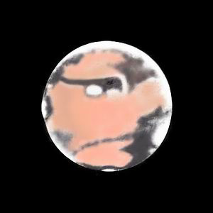
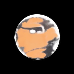
provided a color version of a Mars observation made on June 13, 2001 (02:15
U.T., CM=212.7) using a 4-inch (10-cm) F/10 Off-axis reflector as an example
of what may be produced manually. I have compared the colors rendered to
several CCD images for accuracy.
First Color sample
 Color sample after correction
 I hope that the above summation provides us all with information to consider
when we image the planets in the future. We should always strive for
standardization of techniques in order to better evaluate the data obtained.
Respectfully,
Carlos E. Hernandez
[South Florida U.S.A Carlos E. Hernandez]
I hope that the above summation provides us all with information to consider
when we image the planets in the future. We should always strive for
standardization of techniques in order to better evaluate the data obtained.
Respectfully,
Carlos E. Hernandez
[South Florida U.S.A Carlos E. Hernandez]
 ALPO-Japan HomeALPO-Japan Latest Home